
Kobe Port Tower

Kobe Port Tower

Kobe Port Tower

Kobe Port Tower

Kobe Port Tower

Kobe Port Tower

Kobe Port Tower

Kobe Port Tower

Kobe Port Tower

Kobe Port Tower

Kobe Port Tower
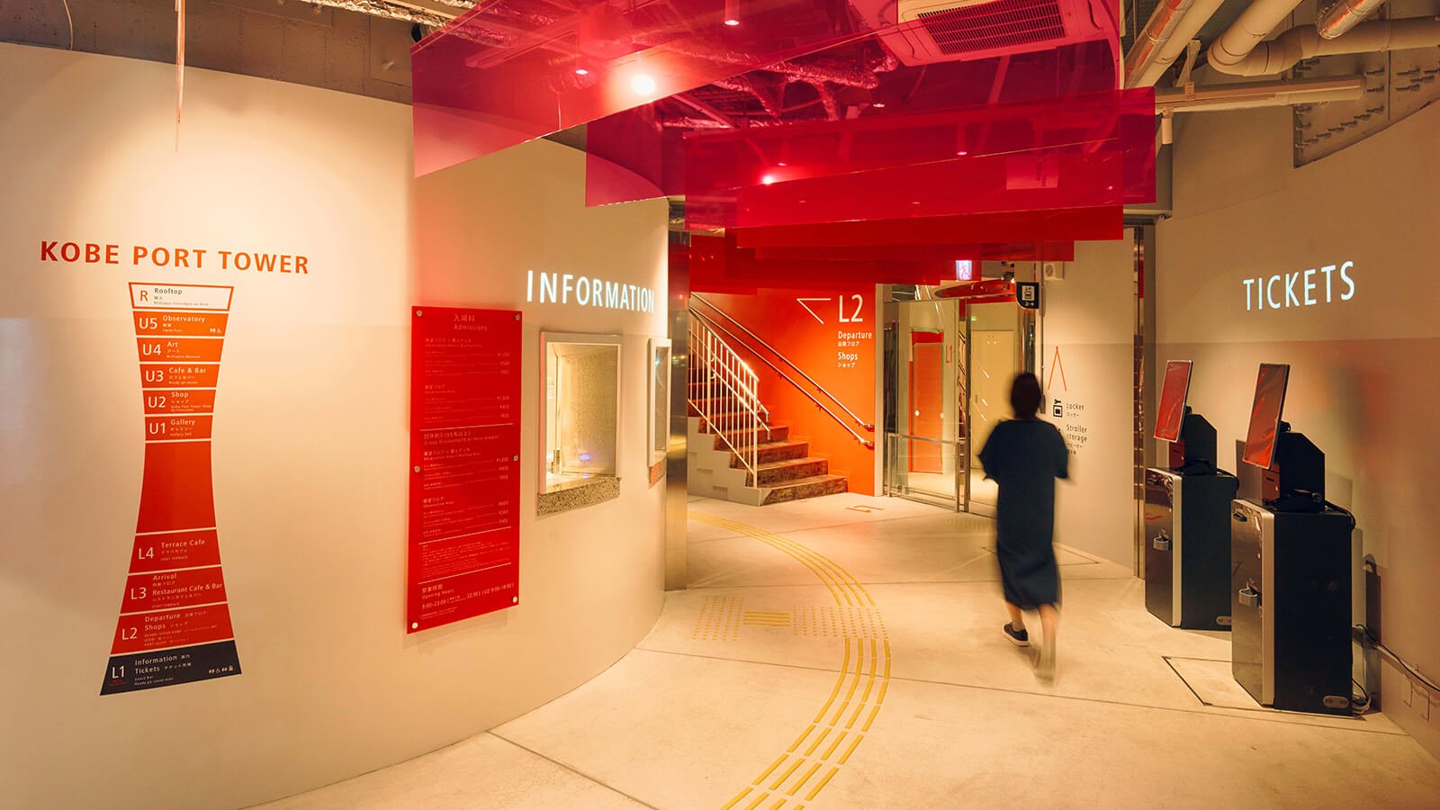
The bright red exterior of the Kobe Port Tower makes it one of this Japanese city’s foremost landmarks and, following the devastating 1995 earthquake, a powerful symbol of resilience. When it reopened in 2024 following seismic reinforcement, the tower’s signature hue became the central element in an innovative wayfinding scheme by Motive Inc. that guides visitors smoothly through its shops, rotating café, art gallery and observation decks. Clear and multilingual written signage is complemented by coloured acrylic panels overhead, which transition from yellow to red as visitors move toward the stairs. Similarly, the shades of red used in wayfinding signage grow subtly deeper as they ascend the structure, contributing to an intuitive experience.
Team: Takuya Wakizaki (MOTIVE Inc.), Kei Takahashi (COL.architects), Yoshihiro Nakamura (VANS ARCHITECTS), Zenshiro Ikehata (studio tanbo)


